My magazine article followed the conventions of a film article that I discovered during my research. I was careful not to divulge the entire plot, as this would make the actual film obsolete, but I included a brief synopsis to provide the reader with the basic storyline and leave them interested in the rest of the film. I put this at the start of the article so that the reader had more of an idea about the film before reading the rest of the article.
I kept a colour scheme throughout my article, keeping a simple white and blue formatting. I think this makes it look more professional and fits with the conventional model of a film magazine article. I did this by colouring the title block, drop quotes and indented captions with blue.

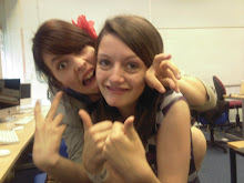
When looking at a Star Trek article from Total Film Magazine I saw that they used images of the production process, and I thought that this would be a good thing to do. Articles include this as it gives the reader the impression that they have more to offer than other sources, and that they're seeing something that other people won't. Because of this I included and image of me during the editing process, and one of the two main characters reading through the script.
 Another common convention of magazine articles is using drop quotes taken from the text that are formatted in bigger, coloured letters. This is because the reader will be drawn to them first, and that means that they will generally be positive or summing up the content of the article. I included positive quotes from some of the actors (actual quotes that I asked them for) to fit with this convention.
 I included the image from my promotional poster, although not with any text on it, instead of stills from the film in order to provide the reader with some idea of what the film would look like without giving too much away. I think that this is the most dramatic image I could have used within this criteria, and it will tie in with the other ancillary task.
At the end of the article I included when a film would be aired on a pre-established short film channel, as this s a common way of ending a film article. I kept my formatting simple as I think that looks more proffesional, and I kept the usual columned format to conform to the standard article model.
However, this draft of my article doesn't include one dominating image to grab the audiences attention and provide anchorage on the articles content. It's only got one side to it, and this doesn't conform to the common conventions of film articles. For my final draft I will make the article on a two-page spread, including one large image.
I will keep the formatting roughly the same in the final draft as this proved sucessful with the focus group I showed the article to. They suggested taking out the image of the promotional poster sans text, though, and that I might want to use stills from the film and production process. I will take these thoughts into account when updating my article.
some points: its dated dec 2009; its page 2, which would be ads/contents; there's far too much white space to the left; lines have forced hyphenation; as per the example you show [take note of the dominant image on this], a double page would be better, and could be filled out with a feature on festivals/outlets for young short film-makers and/or on the additional beeson oeuvre
ReplyDelete