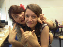
 I originally started developing the first concept that I came up with. For this image I planned to have a single image with very little editing. I went out with my actors and took some pictures but it didn't turn out the way that I wanted. As you can see the cannibals aren't noticable enough, and having the poster set in daytime does detract from the sinister feel that I was trying to put across in the poster, so I decided to develop another concept.
My second concept was the one that I then developed. Although I had originally planned to use images seperate from the film for the poster, I found I was able to use stills, and decided that as this would link the poster closer to the film it would be a better idea. I chose a still from when the girl first says his name at the bridge, as he looks worried but not terrified.
As you can see in the draft sketch that I drew, I'd planned to have an image of one of the cannibals masks fading out of the dark. I took a still from the end of the film as the cannibals swoop down on him for this idea.
I then decided to incorporate the fire into the poster as this is where he discovers that they're cannibals. It's an important setting to the plot and also fire connotes danger so it would suggest that the action is dangerous. I took a still from a clip that I didn't actually use in the film, but it looks very effective. It has the cannibals crowded around the fire, looking down at it as they are before he talks to them. I decided to put this in the background to provide anchorage about what he's afraid of.
Using Photoshop Elements 5.0 I was able to take these two images and put them together. Having used the lasoo with magnet tool to outline the image of Ash, I then put it on a seperate layer in front of the fire image. I then had to blur the edges of the primary image so that it looked as though it had been taken at the same time. I had to adjust the colour saturation and hue so that it looked like he was standing near the fire, but on Photoshop this is very simple and easy to do. This is the image that I used on the final poster.
Also on Photoshop I produced the text that was required to produce an authentic looking promotional poster. I took the tagline "in the woods no one can hear you scream..." directly from the teaser poster as this would provide a link between the two, and I kept the font and colour the same. For the title Masque I tried to use the same text that appears in the titles, but when asking fellow students their opinion it transpired that this didn't look good. Instead I chose to use a Sans Serif font in a dark orange colour (the orange signifying fire). I then applied a slight filter over the top of the text to suggest the words had been burnt, and then put a "ghost" behind the word. This symbolises the supernatural, and adds to the mystery of the poster.
As Ash is an unknown actor I had to write "introducing" before his name, so the audience is aware that he's not a big-name actor. As short films don't often have famour actors in them, this isn't a problem. When researching film posters I discovered that they usually have at least one rating or review on them, usually from a famous source or film magazine. I chose to make mine from Total Film, a well established film magazine, as this would attract the audience that would read this publication. Like the rest of the text, I chose to put the review in orange with the burnt effect placed on top of it. This ties it in with the rest of the image.
The billing block I chose to be in white text as this is a common convention of film posters with dark colouring. It is in a plain font, as it's not the focus of attention. Coming Soon is written in bigger font as this is also common of promotional posters. The BBFC 15 rating mark is placed off-centre, just above the billing block, because this is also not the main focus of the poster but does need to be visable. The billing block contains several different important roles in the production of a film, roles that I noticed were on many movie posters.


No comments:
Post a Comment