In the course outline it gave us a choice of three ancillary tasks; a film poster, a film magazine cover and a film magazine article. For my first task I chose to create a promotional poster for Masque. I chose to do so as my teaser poster was sucessful and I feel I could create a dynamic promotional poster to go alongside it.
Before drafting out a poster I first needed to look at exaisting products to establish the codes and conventions of a promotional poster rather than a teaser poster. I looked at many posters to get a wider range of genres so that I could establish whether each genre had its own characteristics, but I found that most posters are very similar.
As my concept has to fit the common codes and conventions of promotional film posters, there are several features that are present in every poster I have looked at. By incorporating all of these aspects into my poster I should be able to produce a realistic, believeable and high quality promotional poster.Therefore I would need to include;
Cast names (using unknown actors I would have to say "introducing..")
Release date or Coming Soon (generally towards the bottom of the image)
Billing block containing the details of everyone involved in the production of the film
Tagline (taken from my teaser poster)

 The second idea is my favourite of the three I've come up with so far. It has the central character slightly off to the right of the frame against a black background to signify night time. From out of the background appears one of the cannibals masks. This adds to the sinister feel of the image and creates the enigma of why this masked person would be following him. My title is placed high up on the frame in bold, cheerful lettering. This juxtaposition of cheery and sinister is slightly disconcerting and I think this would be an interesting thing to try in my poster. Again, the billing block would be at the bottom of the frame to conform to common conventions.
 My third and final idea goes against convention as it doesn't inclue the central protagonist at all. Instead it has three of the cannibals standing around the fire, wearing the masks (although only one has the mask visable). The title on this concept would be made to look as though it was a shape formed in the rising smoke. I think this does give an interesting and slightly supernatural twist to the entire image. Having the title appearing as from nowhere is reflective of the cannibals. The shot would be taken at night time again to add to the sinister feel of the poster.
Before drafting out a poster I first needed to look at exaisting products to establish
 the codes and conventions of a promotional poster rather than a teaser poster. I looked at many posters to get a wider range of genres so that I could establish whether each genre had its own characteristics, but I found that most posters are very similar.
Almost every film poster I looked at has either the central protagonist or few central characters very prominantly in the foreground of the image. As shown in The Calcium Kid poster, this can just be the central character in some kind of situation that gives exposition to genre or plot, or like The Truman Sh ow it could have the character incorporated into an image that would exist within the setting of the film. For The Truman Show, the poster shows the central character, Truman, on a very large television screen, signifying that he is watched by millions of people. Sometimes (as in Harry Potter and the Philosophers Stone) the main character can be centered, but surrounded by images of supporting characters. This is often used in films with many "big name actors" in, to provide a selling point and create a wider appeal (e.g. Alan Rickman, although only a supporting role, is placed centrally in the image to draw in his fan base)
In my poster I would hope to get a centralised image of Ash Cato n (playing Chris Parks) and also
  find some way of outlining a slight idea of the narrative; not enough to give the plot away but enough to cause interest for the audience.
 ow it could have the character incorporated into an image that would exist within the setting of the film. For The Truman Show, the poster shows the central character, Truman, on a very large television screen, signifying that he is watched by millions of people. Sometimes (as in Harry Potter and the Philosophers Stone) the main character can be centered, but surrounded by images of supporting characters. This is often used in films with many "big name actors" in, to provide a selling point and create a wider appeal (e.g. Alan Rickman, although only a supporting role, is placed centrally in the image to draw in his fan base)
In my poster I would hope to get a centralised image of Ash Cato
 n (playing Chris Parks) and also find some way of outlining a slight idea of the narrative; not enough to give the plot away but enough to cause interest for the audience.
Another way of widening the appeal of a film is to provide intertextual links to other films. This is more often done in satirical productions, or "spoofs," as they are mocking established texts that can be easily linked into posters, promotions and obviously the film itself (for example, Another Teen Movie has references to many teenage-based films). As my film was inspired by Christopher Nolan's The Dark Knight I can try to get some kind of reference to that into my poster. 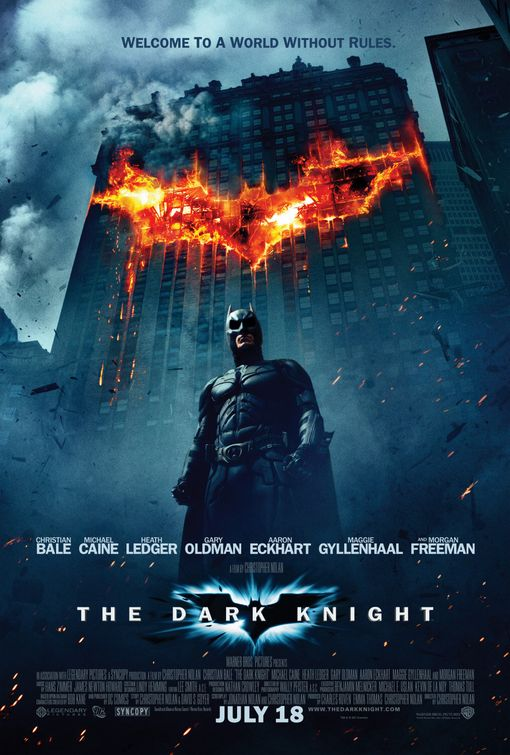
As my film has quite a sinister nature I would like to incorporate the masked figures either in the centre of the frame or behind the central protagonist in order to add sinister implications. Having Ash in the centre of the frame would give anchorage that he's the central character. Using dark colours is typical of both thriller and horror posters, signifying mystery and danger. A blue tint suggests supernatural forces, as seen in the poster for The Dark Knight. Fire on an otherwise dark or dull background draws the eyes attention and as my film does include a fire it might be a good idea to incorporate this into my promotional poster. Again, as half of the film is based in the nighttime, it would be simple to get a dark image to fit in, and so I can use dark colours to suggest the genre/plot.
As my film has quite a sinister nature I would like to incorporate the masked figures either in the centre of the frame or behind the central protagonist in order to add sinister implications. Having Ash in the centre of the frame would give anchorage that he's the central character. Using dark colours is typical of both thriller and horror posters, signifying mystery and danger. A blue tint suggests supernatural forces, as seen in the poster for The Dark Knight. Fire on an otherwise dark or dull background draws the eyes attention and as my film does include a fire it might be a good idea to incorporate this into my promotional poster. Again, as half of the film is based in the nighttime, it would be simple to get a dark image to fit in, and so I can use dark colours to suggest the genre/plot.
As my concept has to fit the common codes and conventions of promotional film posters, there are several features that are present in every poster I have looked at. By incorporating all of these aspects into my poster I should be able to produce a realistic, believeable and high quality promotional poster.Therefore I would need to include;
Cast names (using unknown actors I would have to say "introducing..")
Release date or Coming Soon (generally towards the bottom of the image)
Billing block containing the details of everyone involved in the production of the film
Tagline (taken from my teaser poster)
FIRST DRAFTS / IDEAS

This is the first concept I came up with. I decided that a plain background would be too dull for my poster, and so I have the central protagonist standing against a tree looking worried. In the background, peeking out from behind another tree, are the two other main characters. This image would be taken in daytime, and so would lessen the sinister effect. The title would be just to the side so as not to block the male character, but the billing block would be central at the bottom (this follows the conventions of many movie posters.) I haven't decided where my tagline would go, but in this image probably at the top of the frame.
 The second idea is my favourite of the three I've come up with so far. It has the central character slightly off to the right of the frame against a black background to signify night time. From out of the background appears one of the cannibals masks. This adds to the sinister feel of the image and creates the enigma of why this masked person would be following him. My title is placed high up on the frame in bold, cheerful lettering. This juxtaposition of cheery and sinister is slightly disconcerting and I think this would be an interesting thing to try in my poster. Again, the billing block would be at the bottom of the frame to conform to common conventions.
 My third and final idea goes against convention as it doesn't inclue the central protagonist at all. Instead it has three of the cannibals standing around the fire, wearing the masks (although only one has the mask visable). The title on this concept would be made to look as though it was a shape formed in the rising smoke. I think this does give an interesting and slightly supernatural twist to the entire image. Having the title appearing as from nowhere is reflective of the cannibals. The shot would be taken at night time again to add to the sinister feel of the poster.
No comments:
Post a Comment