Thursday, 11 March 2010

Ancillary Task (dvd cover) - Research

When asking for audience feedback on networking site Facebook, one friend suggested that one of the posters I had created would be good as a DVD cover. Although not part of the original specification for the coursework task, I felt this would be a good idea.
When given this suggestion I looked into the codes and conventions of DVD covers that used one of the promotional posters for the film as the main image.
This is true of the DVD cover for The Dark Knight (Christopher Nolan, 2008). The main promotional poster for the film features the central protagonist in front of a building with the signiture "Batman" symbol burning in the windows. This is a strong image and is easily recognisable. This is why they chose it to be both a poster and dvd cover.

The DVD cover for The Lord of the Rings: Fellowship of the Ring (Peter Jackson, 2001) also features the main poster as the entral image. It features many of the central characters doing things that define them in the film (e.g. Aragorn weilds a sword), providing exposition to the content of the film.

Unlike the previous two DVD covers, the cover for Hard Candy (David Slade, 2005) doesn't show the main character fully, choosing to have her facing away from the camera. The image of a young girl standing in the centre of a large beartrap is striking and will grab the audience's attention. Unlike the other two DVD covers, this one continues the front image onto the spine of the cover, rather than putting a seperate image on.

The DVD cover for Kes (Ken Loach, 1970) also has a single image of the central protagonist on the front cover. It has a plain title in a bright colour, so it grabs attention. This DVD cover also uses the main promotional poster as the central image for the cover.

From studying these DVD covers I have discovered several common elements that are used no matter what genre or plotline the film involves;

  • The image on the front of the cover is bold and attention-grabbing, as this is the first thing the market will see when purchasing the product.
  • The title is in large letters, often in a bright colour to make it stand out further from the background. Again, this is to further promote the film and let the market know quickly which film it is.
  • On the back of the cover is often a series of still shots from the film, highlighting particular characters or situations that might draw special interest.
  • At the top of the cover on the back there will be an image that differs from the one on the front, providing more exposition to the plot. This will generally be a staged photograph, that isn't in the actual film. However, it isn't always (for example, Lord of the Rings has an image of the Moria scene in the film)
  • The billing block, production company logos and distribution logos are always placed at the bottom of the back cover. This will also include the BBFC and film censorship ratings.
  • The spine of the cover always includes a serial number, the title of the film, the production logo and the BBFC rating.
  • If there are extras on the DVD, there will be a box listing them in the centre of the back cover.
  • There is a hologram of the production logo in the bottom right-hand corner of the back cover, next to the barcode. This is to prevent copyright violation.
I will have to conform to these conventions in order to create a realistic DVD cover for Masque.

Monday, 8 March 2010

Ancillary Task (magazine article) - Final Draft

This is my final draft for the magazine ancillary task. For some unknown reason when uploading the document to www.scribd.com, some of the formatting changed so I have included a picture of the formatting that was intended.

Original format:

Final Magazine

In order to conform to the research I had done into the codes and conventions of magazine articles, I chose a dramatic image related to my film to take up one of the pages. This serves to grab attention and provide anchorage for the content of the article. I have used the same image that I used for the second teaser poster, as this links the two together, but I have put in a copy that doesn't include the background and text, focusing only on the girl and the mask.

There are several differences between the actual articles too. The orgiginal article had 3 columns of text, but the final draft only has two. This is due to my research taken from total film articles (In Bruges, Gemma Armerton) showing that articles can still look effective using two columns. It also allowed me to fit more text into the article by reducing the number of columns used.

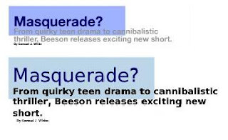
The format of the title banner has changed between the first and second articles. The second articles title is bigger and more eye-catching than the first. The lettering of the sub-caption is bolder and darker, so looks more interesting. The author's name has been slightly indented in the second title banner, showing that it's not part of the title or caption, setting it aside from the other two parts.

In accordance with the audience feedback I received about my first article, I decided to change the bottom right image from my promotional poster image to a still shot taken from the film. This conforms to more existing magazine articles, and gives the reader something new to look at rather than the promotional poster that they would have seen before. I kept the images in the same place as the rest of the formatting looks effective, but due to the difference in size of the two images, I was able to write more in the article as the second image doesn't take up as much space.

One of the most obvious problems with my original article was the amount of blank white space. To remove this problem I made the article bigger, making the images, title banner and text larger. The first article was also right-hand oriented, as it was planned to be a single page article. As my new article is on a two-page spread with the centrefold on the left hand side of the text, I had to change the orientation so it fit the format of the double page spread.

The last difference between my first draft and the final product is the lack of quotes in seperate boxes, using different colours and italics. This is because when doing further research I discovered that this was a technique more commonly used in gossip magazines such as OK and Heat. As this didn't appear very often in film magazines like Total Film I felt it would be innopropriate to include it in my article. I don't think that my article suffers from lack of this.

Wednesday, 17 February 2010

Ancillary Task (poster series) - Drafts.

In addition to producing a promotional poster for my film "Masque," I also decided to create a series of other posters that could be used in a marketing campaign, featuring different designs, characters and aspects of the plot. To do this I used different images, both taken from still shots in the film, or photographs taken separately.

TEASER POSTER #2
For my second teaser poster I also drew inspiration from The Dark Knight. As part of the poster campaign for this film, images of the three central characters hiding part of their faces are used in one of the teaser posters. This is to signify that they're hiding some part of their character from the rest of the world. I thought this was a good concept as the girl has concealed part of her character that only appears at the end of the film. As the film involves white masks, I thought that having the girl holding up half a white mask to her face would be the boldest statement for my second teaser poster.
The first step I took for my teaser poster was to take an image that I took seperately and darken the background. I altered the contrast of the original image on photoshop to make the girl stand out further. By doing this the mask appears brighter than it was previously, and this places more emphasis on it.

I then darkened the original image so it blended more naturally into the black background. I also lessened the saturation of the image to provide a more sinister, dark, unnatural feel to the image. I particularly darkened the left hand side of the girl so that it appears she's coming out of the darkness. Her hair on the right hand side fades into the black background, showing this further.

The next thing I did was to add my tagline. I chose to have a different tagline to the one on the first teaser poster. This is commonly seen in poster series for franchise blockbusters. I chose "EVERY ROSE HAS ITS THORN". This is a commonly known phrase, but I took it out of the song "Every Rose Has Its Thorn" by Poison. In this case, the nameless girl is the 'rose' and her 'thorn' is her cannibalism. It also has the tie-in to nature, as the boy is killed in the woods I thought this would be a good idea.

I then added in the large "COMING SOON" at the bottom of the image that is common of nearly all teaser posters. I also added the URL of my coursework blog as commonly at the bottom of film posters can be found a link to the film's promotional website. Once I had done that, I copied the text layers and then moved them slightly to the side of the first ones. I then blurred them to give the slightly faded glow outside the lettering. By changing the colour to orange it ties in with the fire in the film.

As I felt the image with just a plain black background was dull and wouldn't attract much interest, I decided to take a still from the film of the cannibals gathered around the fire and underlay behind the image of the girl. To do this I put it on
 a separate layer and removed the black background. When I did this the girl looked very out of place as she was in a completely different light to the cannibals. I therefore changed the overall colour to a deep red and faded it slightly, so the image is still visible. However, it made the image darker and less eye-catching than I had wanted, and although audience feedback told me that having the cannibals in the background was a good idea, it also told me that the poster was too dark to be effective as a poster.


This is the final copy of my second teaser poster. As the red overlay on the last draft made the entire image look too dull, I removed it. Instead I just changed the hue of the girl, making her skin redder and her mask with a more blue tint. This signifies that the mask is involved in something supernatural, and the red of her skin signifies the firelight and the blood that comes when the boy is ripped apart. Having the text in a light grey that I took directly from the mask links the two together, and also makes both stand out more to grab attention. I 
think that the link to The Dark Knight posters is a good idea, and the image has proved effective and popular with the audiences that I showed it to. It also provides an intertextual link with a film that has provided much inspiration for Masque. I think that my second teaser poster works well and would attract audiences.

TEASER POSTER #3
I also created another teaser poster featuring the girl, but this one I liked much less, and I don't think is as effective.

For this poster I took a still from the film, shortly before the girl looks up into the camera.
 She looks to be pondering something, and this expression gives her a mysterious aura and provides general interest in the image. Rather than layer her over the cannibals to link that solidly, I merely suggested the link by overlaying her onto an image of fire. As the cannibals congregate around the fire, this provides anchorage to those who've seen the film as to who she is, but generates interest as to why the girl and the fire are linked.

The tagline is again different from the original teaser poster. For this poster, focused solely on the girl, I chose "SHE HAS HIS LOVE, SHE WANTS HIS HEART". This will spark interest as the two are generally links, so the fact that they have been separated implies that she wants his physical heart (which, of course, is true). I used the same typeface, colour and layout as my second teaser poster to provide a link between the two.

I don't like this poster as much because it has less going on in it and it is generally not as strong an advertisement for the film as other posters I've made.

Wednesday, 10 February 2010

Ancillary Task (poster series) - Research

When a new film is released, particularly a hollywood blockbuster that is part of a franchise, the distribution company will often release a series of posters rather than just one. This is true of the recent release The Twilight Saga: New Moon.
Usually, when a company releases more than one promotional poster, there is one main poster which is used most often (shown above, the poster that is largest) and then several posters alongside it. These extra posters usually focus on one character, or show different aspects of the narrative of the film.

(pictured left: Alice Cullen)
This poster focuses on a character who isn't seen as a main character. The yellow car featured in the poster provides exposition to part of the narrative in the film, where Alice steals a yellow porsche in order to race through the Italian town. It also shows several images laid over each other to establish a link between events throughout the narrative (in this case; Alice, Alice's vision of Bella jumping of the cliff, and the car Alice steals).


Other franchises include several versions of the teaser poster, portraying different aspects of the plot or suggesting a different theme in the film. For example, Christopher Nolan's The Dark Knight , released several teaser posters in the run up to release of the film.


Many of these posters feature the main characters, although only two show the faces. In one of the posters, no character is shown at all, with only the Joker's face drawn on a blank jail cell wall, modified to include the bat shape, providing anchorage of the film. In my teaser poster I didn't include my characters, instead focusing on one of the props that linked in with the title. This was due to this convention of concealment of actors faces. Indeed, in the Dark Knight posters that do include the characters, their faces are obscured by certain objects relevant to them (joker card, throwing bat knife, Harvey Dent badge). Again, having the face obscured slightly is another convention of teaser posters, if the face features at all, as shown in the posters featured below from Wolverine, G.I.Joe and Harry Potter and the Half Blood Prince.

Thursday, 31 December 2009

Ancillary Task (magazine article) - First Draft

Helena's Magazine Article height="500" width="100%" > value="http://d1.scribdassets.com/ScribdViewer.swf?document_id=24231713&access_key=key-f7sovvuzf148b3kkykv&page=1&version=1&viewMode=list">
My magazine article followed the conventions of a film article that I discovered during my research. I was careful not to divulge the entire plot, as this would make the actual film obsolete, but I included a brief synopsis to provide the reader with the basic storyline and leave them interested in the rest of the film. I put this at the start of the article so that the reader had more of an idea about the film before reading the rest of the article.
I kept a colour scheme throughout my article, keeping a simple white and blue formatting. I think this makes it look more professional and fits with the conventional model of a film magazine article. I did this by colouring the title block, drop quotes and indented captions with blue.

When looking at a Star Trek article from Total Film Magazine I saw that they used images of the production process, and I thought that this would be a good thing to do. Articles include this as it gives the reader the impression that they have more to offer than other sources, and that they're seeing something that other people won't. Because of this I included and image of me during the editing process, and one of the two main characters reading through the script.
Another common convention of magazine articles is using drop quotes taken from the text that are formatted in bigger, coloured letters. This is because the reader will be drawn to them first, and that means that they will generally be positive or summing up the content of the article. I included positive quotes from some of the actors (actual quotes that I asked them for) to fit with this convention.
I included the image from my promotional poster, although not with any text on it, instead of stills from the film in order to provide the reader with some idea of what the film would look like without giving too much away. I think that this is the most dramatic image I could have used within this criteria, and it will tie in with the other ancillary task.
At the end of the article I included when a film would be aired on a pre-established short film channel, as this s a common way of ending a film article. I kept my formatting simple as I think that looks more proffesional, and I kept the usual columned format to conform to the standard article model.
However, this draft of my article doesn't include one dominating image to grab the audiences attention and provide anchorage on the articles content. It's only got one side to it, and this doesn't conform to the common conventions of film articles. For my final draft I will make the article on a two-page spread, including one large image.
I will keep the formatting roughly the same in the final draft as this proved sucessful with the focus group I showed the article to. They suggested taking out the image of the promotional poster sans text, though, and that I might want to use stills from the film and production process. I will take these thoughts into account when updating my article.

Ancillary Task (magazine article) - Research and Ideas

For my second ancillary task I chose to create a magazine article about my film. I had to do research about what existing magazine article were like. I used 2 main sources; Total Film and Empire, popular film publications.
I looked at several different editions of both magazine, to get comprhensive look at the codes and conventions of film magazine articles. From observing the articles in these magazines I have discovered some common ingredients in designing an article. Things that were present in most, if not all, of the articles I looked at include;
  • Stills from the film - There is usually at least one still from the film OR
  • The poster - either promotional or teaser, although occasionally both are used.
  • There is often at least two columns of text in magazine articles, as this means that more text is fitted onto the page, saving space and money. It also adds to the aesthetics and breaks up the text into smaller sections so it's easier to read for the audience.
  • The headline of the article is generally followed by a smaller caption. The first one will often be a confusing or interesting title, so the caption will often be used to explain it
  • Quotes from the text can be picked out and placed in a seperate box, usually using a different font or colour, so that they are more noticable and draw in the attention of the reader.
  • There is always a colour scheme throughout the article (In the title, the drop quotes, the formatting and outlines).
  • Other forms of media can be advertised, usually at the end of the article. This could be a product (dvd, computer game etc.) or a website.
  • Many articles (such as this one from Total Film) include production pictures or the cast or crew. This gives the reader the impression that they are seeing something that other people won't see, and makes the article more appealing.
  • Most articles are done of a two page spread, and the first page is often taken up by a large picture of one of the characters (or the actor that the article is about). This grabs attention and provides anchorage about what the article is about.
I will try and incorporate as many of these conventions as possible when creating my magazine article to produce an interesting and authentic piece.

Ancillary Task (film poster) - Final Poster

This is the final production of my promotional movie poster. Although I developed other ideas, this was the one that was most sucessfull.

I originally started developing the first concept that I came up with. For this image I planned to have a single image with very little editing. I went out with my actors and took some pictures but it didn't turn out the way that I wanted. As you can see the cannibals aren't noticable enough, and having the poster set in daytime does detract from the sinister feel that I was trying to put across in the poster, so I decided to develop another concept.


My second concept was the one that I then developed. Although I had originally planned to use images seperate from the film for the poster, I found I was able to use stills, and decided that as this would link the poster closer to the film it would be a better idea. I chose a still from when the girl first says his name at the bridge, as he looks worried but not terrified.
As you can see in the draft sketch that I drew, I'd planned to have an image of one of the cannibals masks fading out of the dark. I took a still from the end of the film as the cannibals swoop down on him for this idea.


I think this would have been effective and would have provided a link with the teaser poster, but it was difficult to place it so that it looked good. I tried it out but it didn't produce the effect that I wanted, so I changed my idea. It was also difficult to get an image of the cannibal that wasn't blurred as it was taken during a very fast-paced bit of the film.

I then decided to incorporate the fire into the poster as this is where he discovers that they're cannibals. It's an important setting to the plot and also fire connotes danger so it would suggest that the action is dangerous. I took a still from a clip that I didn't actually use in the film, but it looks very effective. It has the cannibals crowded around the fire, looking down at it as they are before he talks to them. I decided to put this in the background to provide anchorage about what he's afraid of.


Using Photoshop Elements 5.0 I was able to take these two images and put them together. Having used the lasoo with magnet tool to outline the image of Ash, I then put it on a seperate layer in front of the fire image. I then had to blur the edges of the primary image so that it looked as though it had been taken at the same time. I had to adjust the colour saturation and hue so that it looked like he was standing near the fire, but on Photoshop this is very simple and easy to do. This is the image that I used on the final poster.

Also on Photoshop I produced the text that was required to produce an authentic looking promotional poster. I took the tagline "in the woods no one can hear you scream..." directly from the teaser poster as this would provide a link between the two, and I kept the font and colour the same. For the title Masque I tried to use the same text that appears in the titles, but when asking fellow students their opinion it transpired that this didn't look good. Instead I chose to use a Sans Serif font in a dark orange colour (the orange signifying fire). I then applied a slight filter over the top of the text to suggest the words had been burnt, and then put a "ghost" behind the word. This symbolises the supernatural, and adds to the mystery of the poster.

As Ash is an unknown actor I had to write "introducing" before his name, so the audience is aware that he's not a big-name actor. As short films don't often have famour actors in them, this isn't a problem. When researching film posters I discovered that they usually have at least one rating or review on them, usually from a famous source or film magazine. I chose to make mine from Total Film, a well established film magazine, as this would attract the audience that would read this publication. Like the rest of the text, I chose to put the review in orange with the burnt effect placed on top of it. This ties it in with the rest of the image.

The billing block I chose to be in white text as this is a common convention of film posters with dark colouring. It is in a plain font, as it's not the focus of attention. Coming Soon is written in bigger font as this is also common of promotional posters. The BBFC 15 rating mark is placed off-centre, just above the billing block, because this is also not the main focus of the poster but does need to be visable. The billing block contains several different important roles in the production of a film, roles that I noticed were on many movie posters.