
For all of the posters I focused on the two central protagonists and the cannibals, either represented by the masks or gathered by the fire. For the first poster I wanted to incorporate the masked characters to provide a link with my teaser poster. Although they were different masks, I think it is possible to associate the two images successfully. The second poster doesn’t feature the cannibals, but by laying the fire image over the picture of the girl I created a link between the two. As the girl is in the background of the image, looking at the boy, it establishes the link between them that makes up much of the film’s content. In the third promotional poster I focused on the girl only. I used a dramatic image that creates a sense of mystery about her, and this generates interest from the audience as to why she’s been singled out without any background or other characters. The final promotional poster I made is a staged image that is separate from the film itself. It features the central protagonist in the setting of a wood, tying in with the narrative, looking frightened. This will create a narrative enigma as to what he’s so afraid of. All of these posters will generate interest in the narrative. I think they have interesting overall images and entice the audience to watch the film.


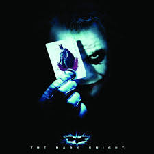
Also to tie in with the teaser poster I included the same tagline in my promotional poster. Although some films have had different taglines for different promotions, (e.g. Nolan's The Dark Knight; teaser poster "Why So Serious?" and promotional poster "Welcome to a World Without Rules") I decided that the same tagline would provide more anchorage that the two posters were referring to the same film. I used the same font for the tagline as well, although made it different from the rest of the font on the poster. The billing block and “coming soon” were written in white, but the tagline and film title were a shade of orange that I took using the palate tool on Photoshop from the heart of the fire. The fire connotes danger and is a sinister source of light in the darkness, so this provides anchorage that my film is quite dark in nature and has a sinister plotline.

To tie in with the first teaser poster, I included the same tagline in my promotional posters. Although some films have had different taglines for different promotions, (e.g. Nolan's The Dark Knight; teaser poster "Why So Serious?" and promotional poster "Welcome to a World Without Rules") I decided that the same tagline would provide more anchorage that the two posters were referring to the same film. However, my teaser posters have differing taglines (“In the woods, no one can hear you scream” “Every rose has its thorn”  “She had his love, she wanted his heart”) in order to provide variety and spark more interest. I used the same font for the tagline in all posters, although made it different from the rest of the font on them. The billing block and “coming soon” were written in white, but the tagline and film title were a shade of orange that I took using the palate tool on Photoshop from the heart of the fire. The fire connotes danger and is a sinister source of light in the darkness, so this provides anchorage that my film is quite dark in nature and has a sinister plotline.
 inspired by a teaser poster from The Dark Knight. She holds a mask over half of her face, signifying that she’s hiding part of who she is, and she stands in front of the cannibals, linking them to her. The last teaser poster that I made has a less effective image, just the girl’s face next to a fire. I don’t think the last one is effective as a teaser poster.
My magazine article followed the conventions of a film article that I discovered during my research. I was careful not to divulge the entire plot, as this would make the actual film obsolete,  but I included a brief synopsis to provide the reader with the basic storyline and leave them interested in the rest of the film. I also included positive quotes from some of the actors (actual quotes that I asked them for) to allow the reader to feel that they were getting more in this magazine than they would in others without direct quotes.
I kept the formatting of my article very  simple and minimalistic as I didn’t want it to look too overdone and tacky. I think being blue and black on a plain white background gives it a more professional look. This format was taken from my research into film magazines such as Empire and Total Film. I included stills from the film and production process to make the article look more appealing to the reader. I included images of myself
  editing the footage and the actors reading through the script to show the full production of the film rather than just the finished product. On the first page I had a large image of the girl covering her face in accordance with the research I had carried out on magazine formatting.
 I also created a DVD cover for my film, using the same image as my fourth promotional poster as the central image. I think that I stuck to the conventions of DVD cover formatting accurately and produced a cover that looks genuine and would entice the audience to buy the film. I included a review from a well-established film magazine, Total Film, to draw in the part of the target audience who read it, and to show that the film is worth watching. I think the text on the back cover could do with some tweaking to sell the film more efficiently, but the overall product does a good job of advertising the film.
No comments:
Post a Comment