
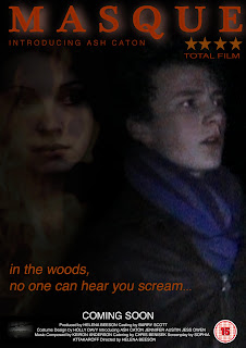
This is my original promotional poster. I then created several other posters to make up a promotional package.
This is the second promotional poster that I created. Again I took stills from the film and laid one over the other. I also used the image of fire from the third teaser poster to overlay the girl, again linking her to the fire in the film. Unlike my first promotional poster, I included my production logo in the bottom. This is a common convention of promotional posters, and so I felt it important to include it. To provide continuity between all the posters I kept all the text, including the billing block and the rating, the same, using the same font and colour, applying the same burnt effect over the title. This was simple to do using photoshop, as I can drag and drop the layers onto a new document. I think this poster is effective, proving popular in the audience feedback I recieved, but it doesn't look as good as others that I have created. 
This is the third poster in my series . Unlike the other two that have Chris, the central protagonist, in the foreground (thus being the focul point) of the image, this poster focuses on the nameless girl. The image is a still from the film, the same one used in the second promotional poster. I chose this image because it shows the girl to be mysterious. This draws interest in the character, and suggests that she's not a character to be underestimated. This was the most popular poster judging by the audience feedback I received on Facebook, causing comments such as "it is far more dramatic and eye catching than the others, and the darkness makes it stand out more." However, this poster only involves one image, and I think more than one image is required to create an effective promotional poster. 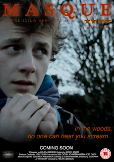
This is the final promotional poster that I came up with. I based it upon my first poster idea. Unfortuately, the only place I could take these pictures meant that the cannibals in the background were too out of focus as they were too far away from the camera. This means they aren't immediately obvious, and thus creates the enigma of wh y he looks so worried. Only one of the cannibals is in this image, as I had to cut the original picture down to fit the A4 format. I kept the text, production logo and BBFC rating the same as the other posters, and this is the only similarity between them. I think the distinct difference of the daytime image against the other blackened backgrounds makes this poster stand out. I think this poster is the most effective promotional poster that I created.
TEASER POSTER SERIES


This is the third poster in my series

This is the final promotional poster that I came up with. I based
TEASER POSTER SERIES


No comments:
Post a Comment