Original format:

Final Magazine
In order to conform to the research I had done into the codes and
 conventions of magazine articles, I chose a dramatic image related to my film to take up one of the pages. This serves to grab attention and provide anchorage for the content of the article. I have used the same image that I used for the second teaser poster, as this links the two together, but I have put in a copy that doesn't include the background and text, focusing only on the girl and the mask.
 There are several differences between the actual articles too. The orgiginal article had 3 columns of text, but the final draft only has two. This is due to my research taken from total film articles (In Bruges, Gemma Armerton) showing that articles can still look effective using two columns. It also allowed me to fit more text into the article by reducing the number of columns used.
 The format of the title banner has changed between the first and second articles. The second articles title is bigger and more eye-catching than the first. The lettering of the sub-caption is bolder and darker, so looks more interesting. The author's name has been slightly indented in the second title banner, showing that it's not part of the title or caption, setting it aside from the other two parts.
 In accordance with the audience feedback I received about my first article, I decided to change the bottom right image from my promotional poster image to a still shot taken from the film. This conforms to more existing magazine articles, and gives the reader something new to look at rather than the promotional poster that they would have seen before. I kept the images in the same place as the rest of the formatting looks effective, but due to the difference in size of the two images, I was able to write more in the article as the second image doesn't take up as much space.
 One of the most obvious problems with my original article was the amount of blank white space. To remove this problem I made the article bigger, making the images, title banner and text larger. The first article was also right-hand oriented, as it was planned to be a single page article. As my new article is on a two-page s
 pread with the centrefold on the left hand side of the text, I had to change the orientation so it fit the format of the double page spread.
 The last difference between my first draft and the final product is the lack of quotes in seperate boxes, using different colours and italics. This is because when doing further research I discovered that this was a technique more commonly used in gossip magazines such as OK and Heat. As this didn't appear very often in film magazines like Total Film I felt it would be innopropriate to include it in my article. I don't think that my article suffers from lack of this.
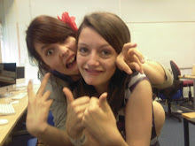
No comments:
Post a Comment