Sunday, 14 March 2010

Evaluation Part 3

What have you learned from your audience feedback?
Throughout my production I have been continually getting audience feedback so that my product could be as sucessful as possible.
  • Due to my initial anamatic not proving popular with the focus group I had available (as it didn't have an interesting twist in it, a very important convention of short films) I decided to change my concept completely and merge it with a sinister cannibal story. When I ran this story past a selection of the target audience they were a lot more positive and so that is the one that I chose to develop.


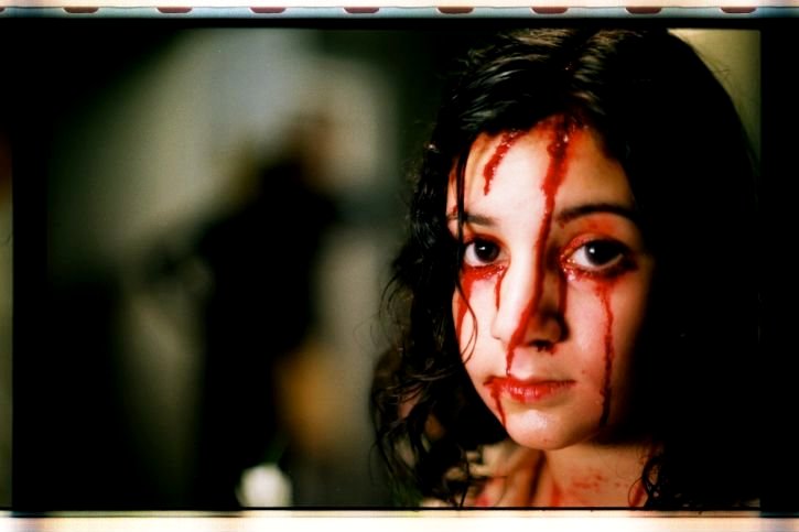
  • Once I had filmed my initial footage for the night time scene (the first scene that I filmed) I pieced it together in sequence and showed it to my media class [this rough cut can be found here]. They were able to give me good, useful audience feedback that I was able to use to improve the scene. They suggested focusing more on the arm shot, as it was difficult to see and needed highlighting, and also that I might want to draw out the ending a bit more as it was too abrupt. One person suggested showing some of his clothing discovered in the woods the next day by some passer-bys, and as other people agreed this would be effective I developed it.

  • After I had filmed the internal scenes I pieced it together with the other footage and put the video on popular networking site Facebook. This was so that I could get an extensive range of feedback from my own age-group, as this is the target audience for my film. As I am friends with several media students on Facebook, I was able to get more technical advice, as well as general plot and aesthetic feedback from others. They suggested improving on the sound quality (which I did by adding in a voiceover when the girl speaks) and they provided suggestions for the type of music that I should use. One person suggested using the stereo to provide music and I developed this to produce the diegetic soundtrack that I settled on.


  • Taken from the inital audience feedback I changed the shot of the arm and then added an extra section at the end, including fading titles (a common feature in many short films I researched) and a panning shot of the woods floor coming to rest on the male characters show that has been discarded. At this point I also had a soundtrack which I put on the footage. I then posted this new rough cut on Facebook to recieve more feedback.


  • From this audience feedback I established that the soundtrack was popular, but the dance track at the start needed to be edited so that it wasn't quite so loud at the start. I then had the idea to make the music diegetic, growing louder and quieter depending where the camera was in relation to the stereo, and then cutting off when the door shut. Many people thought this was a good idea so I used it.

  • At this point I had pretty much finished my editing, but I showed to my media class again to ensure that there wasn't anything else I could do to improve it in the time left. My media teacher suggested that I needed more exposition at the start that shows the relationship between the two characters, but then members of my target audience said that the begining was the right length, if not a little too long. As they were my target audience I decided to keep it the length it was. It was also suggested that I could add some foreshadowing about the cannibalism, either by including someone eating some meat in the background, the characters walking past a butcher shop, or some sort of poster in the background. Had I had the time to reshoot the scene, I wanted to put a large "Meat is Murder" poster behind the two girls as they enter, as in this film eating meat does actually invovle murdering a human being. Unfortunately I ran out of time and resources and was unable to include that.


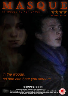
  • Also using the networking site Facebook I was able to publish my film posters and get audience feedback on them. They proved to be popular, and although it was suggested that I should take out the rating and BBFC mark, I felt that it would be sensible to keep these in as they are both common conventions of promotional film posters. It was because of comments on these Facebook pages that I decided to create extra posters and a DVD cover, so audience feedback played a crucial part in that decision.

I found it very useful to have audience feedback throughout the production process. It was particularly useful to be able to air my rough cuts to my media class, as they are not only in my target audience, but they also know technical skills that I could apply to my product realistically. Also through my audience feedback I found out that there is a distinct difference between the opinions of the youth audience and a slightly more mature audience (involving the exposition at the start of the film). This is something that I can use in future productions to understand the audience more fully.

Evaluation Part 2

In what ways does your media product use, develop or challenge forms and conventions of real media products?

Short films are generally anywhere between 3 and 15 minutes long, but I found most were within the 4 to 6 minute bracket. Therefore I made sure that my film fit within this time scale so that it conformed to this general rule. It lasts roughly 5 ½ minutes, so fits comfortably.
My characters develop conventions of not only short films but television dramas and blockbuster films too. My female character, who remains nameless, was based on Effy Stonem from the Channel 4 drama Skins, although the stereotype of mysterious,

practically silent girl is also present in several other existing texts (e.g. Maggie in 17 Again, Ray in Channel 4’s Hollyoaks, Eli in Let The Right One In).

She is presented like this to provide narrative enigma (what makes her so interesting to him?) and also to foreshadow that she will be part of the sinister action later one in the film (connoted by the dark clothing, the almost trance-like way that he follows her without really thinking about it). My central protagonist, Chris Parks, also fits in with convention. He represents the shy, quiet boy who has trouble with confidence and therefore girls (much like Alex in 17 Again, Ron in the Harry Potter series and Christian in Baz Luhrman’s Moulin Rouge).
All of these characters are very shy, and when presented with the chance to talk to his one true love acts foolishly and bashfully (although they generally get a sudden burst of confidence like Christian).


In Masque I’m challenging the stereotypical gender roles. Generally the girl would be shy and reserved, with the boy being the confident one that commands their attention, but I chose to reverse it in this film. This is very like the relationship between Effy and Freddie in Skins at first, and that’s what I tried to imitate. I think that the shy male character would appeal to a female audience, as vulnerable men tend to do, whereas the strong, confident, sexy female character would attract the male audience.
My soundtrack both conformed and challenged conventions of the short films that I researched. The music in short films tends to be primarily to build the tension or enhance the mood of the moment, but for the first section I chose to have diegetic dance music coming from the stereo. I chose to do this to provide anchorage of the age-group of the characters, and also to provide a light-hearted atmosphere to contrast with the sinister one later on. It also allowed me to play around with lyrics, and I was able to time the girl looking into the camera with the word “night”
to add another hint of a sinister plot. However, towards the end of the dance track I put in quiet, drawn out strings notes in order to add a slightly uneasy edge to the music. This drawn out minor key music continues throughout the corridor scene. This provides a narrative enigma; why is the music sinister when the action appears to be very positive? For the second part of the narrative I chose to have a stereotypical soundtrack, using timpani, violins and French horns to reflect the tension and the more dramatic moments in the action. I think that cutting it up was a good idea as it places more emphasis on certain important moments, but I ran out of time towards the end of production so was unable to do this as well as I’d like. I did like the way that the crescendo of drums ended just at the point when they started to rip him apart, and then faded to quiet music for the shoe shot, and this has proved popular with my target audience.

The storylines of short films are generally stranger and quirkier than that of feature length presentations, as due to their short duration they do not have to develop a storyline too thoroughly. However, I chose to base my film around cannibalism, a subject that can be (and indeed has been, e.g. Silence of the Lambs)
developed into a longer narrative. I decided to use cannibalism as the twist because it was interesting and sinister, and provided much scope for several possible storylines. I decided in the end that I would try and merge this idea with my original idea of the love story, and came up with the final narrative.
When researching horror shorts I noticed that the titles were often white text on a black background that faded in either midway through or towards the end. I found that after a particularly tense part of the action the titles faded in to produce most fear in the audience as they have to imagine what’s coming next. Therefore I decided that I would try and use this, and placed a fading black screen just after the cannibals descend on him.
This also acted as a break between the night time scene and the final scene set in the morning.
I sought to conventions in order to make my film stand out and be more interesting, although merely developed some as they had proved successful in other texts.

Evaluation Part 1


How effective is the combination of your main product and ancillary texts?
I think the combination of my main product and my ancillary texts is effective, and they worked together to produce an authentic and believable promotional package. I chose to create a promotional movie poster and a magazine article for my ancillary texts and I think this was a good choice. Both ancillary tasks have certain intriguing aspects, although neither gives too much of the plot away to make the film not worth watching.

For all of the posters I focused on the two central protagonists and the cannibals, either represented by the masks or gathered by the fire. For the first poster I wanted to incorporate the masked characters to provide a link with my teaser poster. Although they were different masks, I think it is possible to associate the two images successfully. The second poster doesn’t feature the cannibals, but by laying the fire image over the picture of the girl I created a link between the two. As the girl is in the background of the image, looking at the boy, it establishes the link between them that makes up much of the film’s content. In the third promotional poster I focused on the girl only. I used a dramatic image that creates a sense of mystery about her, and this generates interest from the audience as to why she’s been singled out without any background or other characters. The final promotional poster I made is a staged image that is separate from the film itself. It features the central protagonist in the setting of a wood, tying in with the narrative, looking frightened. This will create a narrative enigma as to what he’s so afraid of. All of these posters will generate interest in the narrative. I think they have interesting overall images and entice the audience to watch the film.


Also to tie in with the teaser poster I included the same tagline in my promotional poster. Although some films have had different taglines for different promotions, (e.g. Nolan's The Dark Knight; teaser poster "Why So Serious?" and promotional poster "Welcome to a World Without Rules") I decided that the same tagline would provide more anchorage that the two posters were referring to the same film. I used the same font for the tagline as well, although made it different from the rest of the font on the poster. The billing block and “coming soon” were written in white, but the tagline and film title were a shade of orange that I took using the palate tool on Photoshop from the heart of the fire. The fire connotes danger and is a sinister source of light in the darkness, so this provides anchorage that my film is quite dark in nature and has a sinister plotline.

The actor that I used in my film, Ash Caton, is mostly unknown so when including his name in the poster I had to use the word 'introducing' to indicate that he is not a well-known actor. Having un-heard of actors in a common convention of short films as many short films have very limited, if any at all, budgets, so I think it was important to incorporate this in the poster.

To tie in with the first teaser poster, I included the same tagline in my promotional posters. Although some films have had different taglines for different promotions, (e.g. Nolan's The Dark Knight; teaser poster "Why So Serious?" and promotional poster "Welcome to a World Without Rules") I decided that the same tagline would provide more anchorage that the two posters were referring to the same film. However, my teaser posters have differing taglines (“In the woods, no one can hear you scream” “Every rose has its thorn” “She had his love, she wanted his heart”) in order to provide variety and spark more interest. I used the same font for the tagline in all posters, although made it different from the rest of the font on them. The billing block and “coming soon” were written in white, but the tagline and film title were a shade of orange that I took using the palate tool on Photoshop from the heart of the fire. The fire connotes danger and is a sinister source of light in the darkness, so this provides anchorage that my film is quite dark in nature and has a sinister plotline.

With the teaser posters I was unable to include an image of the central protagonist as this would have gone against the conventional model for a teaser (e.g. James Cameron's Avatar poster doesn't include any of the characters). In the first poster I centred the poster around the mask that I had originally intended the cannibals to wear, although the final design of said masks was actually changed in the film. The second focuses on the girl, using an idea inspired by a teaser poster from The Dark Knight. She holds a mask over half of her face, signifying that she’s hiding part of who she is, and she stands in front of the cannibals, linking them to her. The last teaser poster that I made has a less effective image, just the girl’s face next to a fire. I don’t think the last one is effective as a teaser poster.

My magazine article followed the conventions of a film article that I discovered during my research. I was careful not to divulge the entire plot, as this would make the actual film obsolete, but I included a brief synopsis to provide the reader with the basic storyline and leave them interested in the rest of the film. I also included positive quotes from some of the actors (actual quotes that I asked them for) to allow the reader to feel that they were getting more in this magazine than they would in others without direct quotes.

I kept the formatting of my article very simple and minimalistic as I didn’t want it to look too overdone and tacky. I think being blue and black on a plain white background gives it a more professional look. This format was taken from my research into film magazines such as Empire and Total Film. I included stills from the film and production process to make the article look more appealing to the reader. I included images of myself editing the footage and the actors reading through the script to show the full production of the film rather than just the finished product. On the first page I had a large image of the girl covering her face in accordance with the research I had carried out on magazine formatting.

I also created a DVD cover for my film, using the same image as my fourth promotional poster as the central image. I think that I stuck to the conventions of DVD cover formatting accurately and produced a cover that looks genuine and would entice the audience to buy the film. I included a review from a well-established film magazine, Total Film, to draw in the part of the target audience who read it, and to show that the film is worth watching. I think the text on the back cover could do with some tweaking to sell the film more efficiently, but the overall product does a good job of advertising the film.

I think that all my ancillary texts provided the audience with interesting images and information that would make my film appealing. Having a four-star rating on the poster and review on the DVD cover from Total Film, a well known film magazine, would not only show the audience that the film is a good one, but also make it appeal to readers of the magazine, potentially widening the target audience. Similarly, including positive comments in the article would make people want to see why critics have acclaimed the film by watching it themselves. I think that the images used will make the film appear interesting and appealing to the audience, and that’s why I think that my ancillary texts are complimentary to my film. I think that the overall package is very effective and would attract a wide audience.

Saturday, 13 March 2010

Ancillary Task (DVD cover) - Final Draft.

In addition to the poster series and magazine article ancillary tasks, I also created a DVD cover for my film. Although this is unusual for a short film of only 5 minutes long, I felt that it would develop my knowledge of marketing and how image and text can work together to create a cover that would be appealing to the target market.


This is the DVD cover that I created. I tried to keep to the codes and conventions that I listed when doing the research into DVD covers.

The image on the front of a DVD cover has to be eye-catching and interesting, as well as provide some exposition to the genre and narrative of the film. I chose the image from one of my promotional posters, of the central protagonist in the woods being afraid of the cannibals in the trees behind him. As already said in the poster series post, the cannibals didn't show up in the photograph, so I chose to cut down the image so the boy was central. I applied a blue tint over the image to create greater contrast between it and the text, but also to signify sombreity. A blue tint also has supernatural conntations, which ties in with cannibalism in the narrative. Although cannibalism isn't strictly supernatural, the blue tint signifies that something's wrong.

The title on the front cover is in bright, bold, orange letters. These stand out from the black background that it's on, meaning the film's name is instantly visable. The colour and burnt effect tie in with the fire in the narrative, and as it's the same as in the posters they link together as a promotional package.

In every DVD cover that I researched there was a series of still shots on the back cover. I chose some of the key shots from the film; the girls' first entrance, when Chris first meets the girl, when the girl looks up into the camera, and when the cannibals are first seen. I surrounded them with orange outlines to make them stand out, and I enlarged the one involving Chris to signify that he's the central protagonist that the narrative is based around.

On the back cover is a picture taken from the second teaser poster. It shows the girl appearing out of the darkness holding a mask to her facing, signifying that she's hiding part of her personality (the cannibalistic part). This fits with convention as the image at the top of the back cover is generally a staged one seperate from the film. This image will also generally be quite dramatic, as it will help encourage the audience to buy the dvd.

On DVD covers at the bottom there is a section given over to ratings, information, barcode and the billing block. I tried to recreate this as accurately as possible, using the BBFC and film censorship ratings used on actual covers. I observed the layout that this section of the cover takes and tried to recreate it to ensure the cover looked as genuine as possible.

On the spine of the DVD cover I have included the production logo, the title, BBFC rating, serial number and the DVD video logo. These are all commonly found on the spines of DVD covers.

Although a very minor part of my DVD cover, I have included a hologram of my production logo. These appear on DVD covers to help prevent copyright fraud, and so are important to remember.

Some DVD covers (although not all) include a quote from a review of the film. As my promotional posters included a rating from Total Film, I decided to use this well-established film magazine as my source. The quote reads "A film to get your teeth into," which is a pun on the cannibalistic theme.

On nearly every single DVD or VHS back cover is a synopsis of the film, along with further information about the actors or director. I put this in white on a black background to make it stand out (and also bring out the mask) and shaped the text to fit around the shape of the girl's body.

I also included a Director's Cut Edition banner at the top of the front cover, and the actors names in capital letters below it.

I think that my DVD cover looks genuine and works well with the other ancillary tasks that I've done.

Thursday, 11 March 2010

Ancillary Task (poster series) - Final Drafts.

PROMOTIONAL POSTER SERIES

This is my
original promotional poster. I then created several other posters to make up a promotional package.


This is the second promotional poster that I created. Again I took stills from the film and laid one over the other. I also used the image of fire from the third teaser poster to overlay the girl, again linking her to the fire in the film. Unlike my first promotional poster, I included my production logo in the bottom.
This is a common convention of promotional posters, and so I felt it important to include it. To provide continuity between all the posters I kept all the text, including the billing block and the rating, the same, using the same font and colour, applying the same burnt effect over the title. This was simple to do using photoshop, as I can drag and drop the layers onto a new
document. I think this poster is effective, proving popular in the audience feedback I recieved, but it doesn't look as good as others that I have created.

This is the third poster in my series
. Unlike the other two that have Chris, the central protagonist, in the foreground (thus being the focul point) of the image, this poster focuses on the nameless girl. The image is a still from the film, the same one used in the second promotional poster. I chose this image because it shows
the girl to be mysterious. This draws interest in the character, and suggests that she's not a character to be underestimated. This was the most popular poster judging by the audience feedback I received on Facebook, causing comments such as "it is far more dramatic and eye catching than the others, and the darkness makes it stand out more." However, this poster only involves one image, and I think more than one image is required to create an effective promotional poster.

This is the final promotional poster that I came up with. I based
it upon my first poster idea. Unfortuately, the only place I could take these pictures meant that the cannibals in the background were too out of focus as they were too far away from the camera. This means they aren't immediately obvious, and thus creates the enigma of wh y he looks so worried. Only one of the cannibals is in this image, as I had to cut the original picture down to fit the A4 format. I kept the text, production logo and BBFC rating the same as the other posters, and this is the only similarity between them. I think the distinct difference of the daytime image against the other blackened backgrounds makes this poster stand out. I think this poster is the most effective promotional poster that I created.

TEASER POSTER SERIES


Ancillary Task (dvd cover) - Research

When asking for audience feedback on networking site Facebook, one friend suggested that one of the posters I had created would be good as a DVD cover. Although not part of the original specification for the coursework task, I felt this would be a good idea.
When given this suggestion I looked into the codes and conventions of DVD covers that used one of the promotional posters for the film as the main image.
This is true of the DVD cover for The Dark Knight (Christopher Nolan, 2008). The main promotional poster for the film features the central protagonist in front of a building with the signiture "Batman" symbol burning in the windows. This is a strong image and is easily recognisable. This is why they chose it to be both a poster and dvd cover.

The DVD cover for The Lord of the Rings: Fellowship of the Ring (Peter Jackson, 2001) also features the main poster as the entral image. It features many of the central characters doing things that define them in the film (e.g. Aragorn weilds a sword), providing exposition to the content of the film.

Unlike the previous two DVD covers, the cover for Hard Candy (David Slade, 2005) doesn't show the main character fully, choosing to have her facing away from the camera. The image of a young girl standing in the centre of a large beartrap is striking and will grab the audience's attention. Unlike the other two DVD covers, this one continues the front image onto the spine of the cover, rather than putting a seperate image on.

The DVD cover for Kes (Ken Loach, 1970) also has a single image of the central protagonist on the front cover. It has a plain title in a bright colour, so it grabs attention. This DVD cover also uses the main promotional poster as the central image for the cover.

From studying these DVD covers I have discovered several common elements that are used no matter what genre or plotline the film involves;

  • The image on the front of the cover is bold and attention-grabbing, as this is the first thing the market will see when purchasing the product.
  • The title is in large letters, often in a bright colour to make it stand out further from the background. Again, this is to further promote the film and let the market know quickly which film it is.
  • On the back of the cover is often a series of still shots from the film, highlighting particular characters or situations that might draw special interest.
  • At the top of the cover on the back there will be an image that differs from the one on the front, providing more exposition to the plot. This will generally be a staged photograph, that isn't in the actual film. However, it isn't always (for example, Lord of the Rings has an image of the Moria scene in the film)
  • The billing block, production company logos and distribution logos are always placed at the bottom of the back cover. This will also include the BBFC and film censorship ratings.
  • The spine of the cover always includes a serial number, the title of the film, the production logo and the BBFC rating.
  • If there are extras on the DVD, there will be a box listing them in the centre of the back cover.
  • There is a hologram of the production logo in the bottom right-hand corner of the back cover, next to the barcode. This is to prevent copyright violation.
I will have to conform to these conventions in order to create a realistic DVD cover for Masque.

Monday, 8 March 2010

Ancillary Task (magazine article) - Final Draft

This is my final draft for the magazine ancillary task. For some unknown reason when uploading the document to www.scribd.com, some of the formatting changed so I have included a picture of the formatting that was intended.

Original format:

Final Magazine

In order to conform to the research I had done into the codes and conventions of magazine articles, I chose a dramatic image related to my film to take up one of the pages. This serves to grab attention and provide anchorage for the content of the article. I have used the same image that I used for the second teaser poster, as this links the two together, but I have put in a copy that doesn't include the background and text, focusing only on the girl and the mask.

There are several differences between the actual articles too. The orgiginal article had 3 columns of text, but the final draft only has two. This is due to my research taken from total film articles (In Bruges, Gemma Armerton) showing that articles can still look effective using two columns. It also allowed me to fit more text into the article by reducing the number of columns used.

The format of the title banner has changed between the first and second articles. The second articles title is bigger and more eye-catching than the first. The lettering of the sub-caption is bolder and darker, so looks more interesting. The author's name has been slightly indented in the second title banner, showing that it's not part of the title or caption, setting it aside from the other two parts.

In accordance with the audience feedback I received about my first article, I decided to change the bottom right image from my promotional poster image to a still shot taken from the film. This conforms to more existing magazine articles, and gives the reader something new to look at rather than the promotional poster that they would have seen before. I kept the images in the same place as the rest of the formatting looks effective, but due to the difference in size of the two images, I was able to write more in the article as the second image doesn't take up as much space.

One of the most obvious problems with my original article was the amount of blank white space. To remove this problem I made the article bigger, making the images, title banner and text larger. The first article was also right-hand oriented, as it was planned to be a single page article. As my new article is on a two-page spread with the centrefold on the left hand side of the text, I had to change the orientation so it fit the format of the double page spread.

The last difference between my first draft and the final product is the lack of quotes in seperate boxes, using different colours and italics. This is because when doing further research I discovered that this was a technique more commonly used in gossip magazines such as OK and Heat. As this didn't appear very often in film magazines like Total Film I felt it would be innopropriate to include it in my article. I don't think that my article suffers from lack of this.