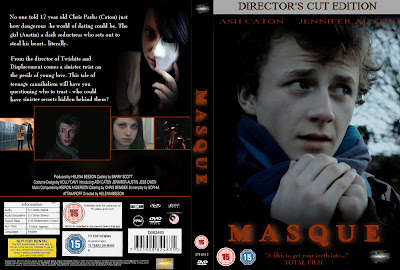
This is the DVD cover that I created. I tried to keep to the codes and conventions that I listed when doing the research into DVD covers.
 The image on the front of a DVD cover has to be eye-catching and interesting, as well as provide some exposition to the genre and narrative of the film. I chose the image from one of my promotional posters, of the central protagonist in the woods being afraid of the cannibals in the trees behind him. As already said in the poster series post, the cannibals didn't show up in the photograph, so I chose to cut down the image so the boy was central. I applied a blue tint over the image to create greater contrast between it and the text, but also to signify sombreity. A blue tint also has supernatural conntations, which ties in with cannibalism in the narrative. Although cannibalism isn't strictly supernatural, the blue tint signifies that something's wrong.
 The title on the front cover is in bright, bold, orange letters. These stand out from the black background that it's on, meaning the film's name is instantly visable. The colour and burnt effect tie in with the fire in the narrative, and as it's the same as in the posters they link together as a promotional package.
 In every DVD cover that I researched there was a series of still shots on the back cover. I chose some of the key shots from the film; the girls' first entrance, when Chris first meets the girl, when the girl looks up into the camera, and when the cannibals are first seen. I surrounded them with orange outlines to make them stand out, and I enlarged the one
  involving Chris to signify that he's the central protagonist that the narrative is based around.
On the back cover is a picture taken from the second teaser poster. It shows the girl appearing out of the darkness holding a mask to her facing, signifying that she's hiding part of her personality (the cannibalistic part). This fits with convention as the image at the top of the back cover is generally a staged one seperate from the film. This image will also generally be quite dramatic, as it will help encourage the audience to buy the dvd.
 On DVD covers at the bottom there is a section given over to ratings, information, barcode and the billing block. I tried to recreate this as accurately as possible, using the BBFC and film censorship ratings used on actual covers. I observed the layout that this section of the cover takes and tried to recreate it to ensure the cover looked as genuine as possible.
 On the spine of the DVD cover I have included the production logo, the title, BBFC rating, serial number and the DVD video logo. These are all commonly found on the spines of DVD covers.
 Although a very minor part of my DVD cover, I have included a hologram of my production logo. These appear on DVD covers to help prevent copyright fraud, and so are important to remember.
 Some DVD covers (although not all) include a quote from a review of the film. As my promotional posters included a rating from Total Film, I decided to use this well-established film magazine as my source. The quote reads "A film to get your teeth into," which is a pun on the cannibalistic theme.
 On nearly every single DVD or VHS back cover is a synopsis of the film, along with further information about the actors or director. I put this in white on a black background to make it stand out (and also bring out the mask) and shaped the text to fit around the shape of the girl's body.
I also included a Director's Cut Edition banner at the top of the front cover, and the actors names in capital letters below it.
I think that my DVD cover looks genuine and works well with the other ancillary tasks that I've done.

No comments:
Post a Comment