Thursday, 31 December 2009

Ancillary Task (magazine article) - First Draft

Helena's Magazine Article height="500" width="100%" > value="http://d1.scribdassets.com/ScribdViewer.swf?document_id=24231713&access_key=key-f7sovvuzf148b3kkykv&page=1&version=1&viewMode=list">
My magazine article followed the conventions of a film article that I discovered during my research. I was careful not to divulge the entire plot, as this would make the actual film obsolete, but I included a brief synopsis to provide the reader with the basic storyline and leave them interested in the rest of the film. I put this at the start of the article so that the reader had more of an idea about the film before reading the rest of the article.
I kept a colour scheme throughout my article, keeping a simple white and blue formatting. I think this makes it look more professional and fits with the conventional model of a film magazine article. I did this by colouring the title block, drop quotes and indented captions with blue.

When looking at a Star Trek article from Total Film Magazine I saw that they used images of the production process, and I thought that this would be a good thing to do. Articles include this as it gives the reader the impression that they have more to offer than other sources, and that they're seeing something that other people won't. Because of this I included and image of me during the editing process, and one of the two main characters reading through the script.
Another common convention of magazine articles is using drop quotes taken from the text that are formatted in bigger, coloured letters. This is because the reader will be drawn to them first, and that means that they will generally be positive or summing up the content of the article. I included positive quotes from some of the actors (actual quotes that I asked them for) to fit with this convention.
I included the image from my promotional poster, although not with any text on it, instead of stills from the film in order to provide the reader with some idea of what the film would look like without giving too much away. I think that this is the most dramatic image I could have used within this criteria, and it will tie in with the other ancillary task.
At the end of the article I included when a film would be aired on a pre-established short film channel, as this s a common way of ending a film article. I kept my formatting simple as I think that looks more proffesional, and I kept the usual columned format to conform to the standard article model.
However, this draft of my article doesn't include one dominating image to grab the audiences attention and provide anchorage on the articles content. It's only got one side to it, and this doesn't conform to the common conventions of film articles. For my final draft I will make the article on a two-page spread, including one large image.
I will keep the formatting roughly the same in the final draft as this proved sucessful with the focus group I showed the article to. They suggested taking out the image of the promotional poster sans text, though, and that I might want to use stills from the film and production process. I will take these thoughts into account when updating my article.

Ancillary Task (magazine article) - Research and Ideas

For my second ancillary task I chose to create a magazine article about my film. I had to do research about what existing magazine article were like. I used 2 main sources; Total Film and Empire, popular film publications.
I looked at several different editions of both magazine, to get comprhensive look at the codes and conventions of film magazine articles. From observing the articles in these magazines I have discovered some common ingredients in designing an article. Things that were present in most, if not all, of the articles I looked at include;
  • Stills from the film - There is usually at least one still from the film OR
  • The poster - either promotional or teaser, although occasionally both are used.
  • There is often at least two columns of text in magazine articles, as this means that more text is fitted onto the page, saving space and money. It also adds to the aesthetics and breaks up the text into smaller sections so it's easier to read for the audience.
  • The headline of the article is generally followed by a smaller caption. The first one will often be a confusing or interesting title, so the caption will often be used to explain it
  • Quotes from the text can be picked out and placed in a seperate box, usually using a different font or colour, so that they are more noticable and draw in the attention of the reader.
  • There is always a colour scheme throughout the article (In the title, the drop quotes, the formatting and outlines).
  • Other forms of media can be advertised, usually at the end of the article. This could be a product (dvd, computer game etc.) or a website.
  • Many articles (such as this one from Total Film) include production pictures or the cast or crew. This gives the reader the impression that they are seeing something that other people won't see, and makes the article more appealing.
  • Most articles are done of a two page spread, and the first page is often taken up by a large picture of one of the characters (or the actor that the article is about). This grabs attention and provides anchorage about what the article is about.
I will try and incorporate as many of these conventions as possible when creating my magazine article to produce an interesting and authentic piece.

Ancillary Task (film poster) - Final Poster

This is the final production of my promotional movie poster. Although I developed other ideas, this was the one that was most sucessfull.

I originally started developing the first concept that I came up with. For this image I planned to have a single image with very little editing. I went out with my actors and took some pictures but it didn't turn out the way that I wanted. As you can see the cannibals aren't noticable enough, and having the poster set in daytime does detract from the sinister feel that I was trying to put across in the poster, so I decided to develop another concept.


My second concept was the one that I then developed. Although I had originally planned to use images seperate from the film for the poster, I found I was able to use stills, and decided that as this would link the poster closer to the film it would be a better idea. I chose a still from when the girl first says his name at the bridge, as he looks worried but not terrified.
As you can see in the draft sketch that I drew, I'd planned to have an image of one of the cannibals masks fading out of the dark. I took a still from the end of the film as the cannibals swoop down on him for this idea.


I think this would have been effective and would have provided a link with the teaser poster, but it was difficult to place it so that it looked good. I tried it out but it didn't produce the effect that I wanted, so I changed my idea. It was also difficult to get an image of the cannibal that wasn't blurred as it was taken during a very fast-paced bit of the film.

I then decided to incorporate the fire into the poster as this is where he discovers that they're cannibals. It's an important setting to the plot and also fire connotes danger so it would suggest that the action is dangerous. I took a still from a clip that I didn't actually use in the film, but it looks very effective. It has the cannibals crowded around the fire, looking down at it as they are before he talks to them. I decided to put this in the background to provide anchorage about what he's afraid of.


Using Photoshop Elements 5.0 I was able to take these two images and put them together. Having used the lasoo with magnet tool to outline the image of Ash, I then put it on a seperate layer in front of the fire image. I then had to blur the edges of the primary image so that it looked as though it had been taken at the same time. I had to adjust the colour saturation and hue so that it looked like he was standing near the fire, but on Photoshop this is very simple and easy to do. This is the image that I used on the final poster.

Also on Photoshop I produced the text that was required to produce an authentic looking promotional poster. I took the tagline "in the woods no one can hear you scream..." directly from the teaser poster as this would provide a link between the two, and I kept the font and colour the same. For the title Masque I tried to use the same text that appears in the titles, but when asking fellow students their opinion it transpired that this didn't look good. Instead I chose to use a Sans Serif font in a dark orange colour (the orange signifying fire). I then applied a slight filter over the top of the text to suggest the words had been burnt, and then put a "ghost" behind the word. This symbolises the supernatural, and adds to the mystery of the poster.

As Ash is an unknown actor I had to write "introducing" before his name, so the audience is aware that he's not a big-name actor. As short films don't often have famour actors in them, this isn't a problem. When researching film posters I discovered that they usually have at least one rating or review on them, usually from a famous source or film magazine. I chose to make mine from Total Film, a well established film magazine, as this would attract the audience that would read this publication. Like the rest of the text, I chose to put the review in orange with the burnt effect placed on top of it. This ties it in with the rest of the image.

The billing block I chose to be in white text as this is a common convention of film posters with dark colouring. It is in a plain font, as it's not the focus of attention. Coming Soon is written in bigger font as this is also common of promotional posters. The BBFC 15 rating mark is placed off-centre, just above the billing block, because this is also not the main focus of the poster but does need to be visable. The billing block contains several different important roles in the production of a film, roles that I noticed were on many movie posters.

Friday, 18 December 2009

Final Cut

This is the final cut of my film, Masque.


Thursday, 17 December 2009

Final Storyboard.

Storyboard Sheet 1

Storyboard Sheet 2

Ancillary Task (film poster) - Research and Ideas

In the course outline it gave us a choice of three ancillary tasks; a film poster, a film magazine cover and a film magazine article. For my first task I chose to create a promotional poster for Masque. I chose to do so as my teaser poster was sucessful and I feel I could create a dynamic promotional poster to go alongside it.

Before drafting out a poster I first needed to look at exaisting products to establish the codes and conventions of a promotional poster rather than a teaser poster. I looked at many posters to get a wider range of genres so that I could establish whether each genre had its own characteristics, but I found that most posters are very similar.


Almost every film poster I looked at has either the central protagonist or few central characters very prominantly in the foreground of the image. As shown in The Calcium Kid poster, this can just be the central character in some kind of situation that gives exposition to genre or plot, or like The Truman Show it could have the character incorporated into an image that would exist within the setting of the film. For The Truman Show, the poster shows the central character, Truman, on a very large television screen, signifying that he is watched by millions of people. Sometimes (as in Harry Potter and the Philosophers Stone) the main character can be centered, but surrounded by images of supporting characters. This is often used in films with many "big name actors" in, to provide a selling point and create a wider appeal (e.g. Alan Rickman, although only a supporting role, is placed centrally in the image to draw in his fan base)
In my poster I would hope to get a centralised image of Ash Caton (playing Chris Parks) and also find some way of outlining a slight idea of the narrative; not enough to give the plot away but enough to cause interest for the audience.


Another way of widening the appeal of a film is to provide intertextual links to other films. This is more often done in satirical productions, or "spoofs," as they are mocking established texts that can be easily linked into posters, promotions and obviously the film itself (for example, Another Teen Movie has references to many teenage-based films). As my film was inspired by Christopher Nolan's The Dark Knight I can try to get some kind of reference to that into my poster.
As my film has quite a sinister nature I would like to incorporate the masked figures either in the centre of the frame or behind the central protagonist in order to add sinister implications. Having Ash in the centre of the frame would give anchorage that he's the central character. Using dark colours is typical of both thriller and horror posters, signifying mystery and danger. A blue tint suggests supernatural forces, as seen in the poster for The Dark Knight. Fire on an otherwise dark or dull background draws the eyes attention and as my film does include a fire it might be a good idea to incorporate this into my promotional poster. Again, as half of the film is based in the nighttime, it would be simple to get a dark image to fit in, and so I can use dark colours to suggest the genre/plot.


As my concept has to fit the common codes and conventions of promotional film posters, there are several features that are present in every poster I have looked at. By incorporating all of these aspects into my poster I should be able to produce a realistic, believeable and high quality promotional poster.Therefore I would need to include;

Cast names (using unknown actors I would have to say "introducing..")
Release date or Coming Soon (generally towards the bottom of the image)
Billing block containing the details of everyone involved in the production of the film
Tagline (taken from my teaser poster)

FIRST DRAFTS / IDEAS

This is the first concept I came up with. I decided that a plain background would be too dull for my poster, and so I have the central protagonist standing against a tree looking worried. In the background, peeking out from behind another tree, are the two other main characters. This image would be taken in daytime, and so would lessen the sinister effect. The title would be just to the side so as not to block the male character, but the billing block would be central at the bottom (this follows the conventions of many movie posters.) I haven't decided where my tagline would go, but in this image probably at the top of the frame.

The second idea is my favourite of the three I've come up with so far. It has the central character slightly off to the right of the frame against a black background to signify night time. From out of the background appears one of the cannibals masks. This adds to the sinister feel of the image and creates the enigma of why this masked person would be following him. My title is placed high up on the frame in bold, cheerful lettering. This juxtaposition of cheery and sinister is slightly disconcerting and I think this would be an interesting thing to try in my poster. Again, the billing block would be at the bottom of the frame to conform to common conventions.
My third and final idea goes against convention as it doesn't inclue the central protagonist at all. Instead it has three of the cannibals standing around the fire, wearing the masks (although only one has the mask visable). The title on this concept would be made to look as though it was a shape formed in the rising smoke. I think this does give an interesting and slightly supernatural twist to the entire image. Having the title appearing as from nowhere is reflective of the cannibals. The shot would be taken at night time again to add to the sinister feel of the poster.

Screenplay

M a S Q U E Screenplay

Problems with filming (Corridor Scene)

When filming in the common room there was a lot of background noise which I wanted, but because I had to keep taking different shots the sound is inconsistent throughout the scene. To counter this I’ll have to take a long take of sound from in the sixth form centre and play it alongside the footage to keep continuity.
I had originally planned for the girls to sit at the farthest end of the common room from the boy but I realised that from the boy’s point of view he couldn’t see them, so I had to move them closer to him. This meant that I was able to add in the bit with him hiding his sketchbook, which my audience feedback proved was popular.
As the sixth form centre is a public space I had to make sure not to get anyone extra in the back that would affect my continuity. This was difficult, particularly when they leave the room, but luckily the people walking past the door were already extras in my film. Unfortunately one of them was the girl’s best friend Sophie, but in the shot in question she is wearing different clothes and has her face hidden so it shouldn’t matter too much.
Out in the corridor the main problem was sound quality. As I was pushed for time I was unable to use the boom mic, and the lines came out very quietly and greatly compromised by background sound (particularly troublesome was people closing doors or shouting to friends). This may require re-shooting or possibly over-dubbing some sound in the editing process.

Wednesday, 16 December 2009

Soundtrack.

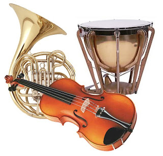
Myself and Keiron Anderson composed my soundtrack using the music software Cubase and Ejay. On cubase we were able play the video alongside the music track so we could be sure that the two went together. For the diegetic dance track in the first half of the film, we used Ejay because it specialises in dance music, and had pre-recorded vocals that we were able to use. For the tenser parts of the film, on Cubase we were able to generate long, drawn out violin notes (a typical convention of horror soundtrack as it enhances tension), french horns (to add more depth and to create an eerie, sinister sound) and timpani drums to emphasise the dramatic moments. I think the track we composed adds well to the tension and atmosphere of the film.


After audience feedback, many people thought that the orchestral track was very complimentary to the film, adding to the atmosphere particularly well. Several people disliked the dance track at the starts, although they did tend to think that was due to personal taste. Once the levels had been changed to make it seem more diegetic, they were able to tell that it was meant to be coming from the stereo in the room and thought it was worth keeping in.

For my final product I chose to break the original soundtrack up in order to create the most effective atmosphere that I could. For example, during the first scene, the unnamed girl looks directly into the camera to signify looking at the boy. I timed this with the word "night" in the soundtrack, as night is often associated with dark and sinister events.


I then decided, as there was diegetic talking on the video track, that I would fade it out up to the point where the girl looks up. This signifies that she's drifting off into her own world, and focussing solely on the boy. I think this also gives her a more interesting, mysterious aura.


When I fit the soundtrack that we had written with the visual I already had, I found that the crescendo of timpani drums was placed just a few seconds too soon for optimum impact as the cannibals descend. I also had soundtrack playing throughout the title screen of "Masque," which I didn't think sounded right.


Therefore, during the editing stage, I cut the track so that I could have the crescendo just as the cannibals swoop down on the camera, and faded out the backing music for the title screen to just leave a solitary scream, highlighting the fact that his screams are futile as no-one will hear them.


Sample and audience feedback.

I showed this sample to my media class and some of my actors to find out what they thought about it.


On the whole people liked the way it had been filmed and put together. The main thing that came up was that the arm on the ground wasn't very obvious (due to the pag light being too far away from it) and so I might want to re-shoot that or add in another shot.
Another comment that came up was that the ending was too abrupt; the scream didn't go on for long enough and it felt like it hadn't really ended. One person suggested that I add my title in there to carry on the shot a bit more, but it would require me to record another scream (in the shot used the character started laughing after I cut it off).

Problems with filming (external scene)

I filmed the majority of the external, nighttime scene today. Unfortunately the sound quality is not as good as hoped due to not being able to use the boom mic as it was too muddy underfoot. I used special firelighter logs to create the fire in my scene, which I originally worried wouldn't be realistic enough to make a proper fire, but they worked really well. I had problems with lighting, as it was so dark I wasn't able to pick up much on camera, but luckily I was able to borrow a pag light from a friend who works with film and that greatly enhanced my images. It wasn't the best it could have been, only certain things that were close to either the pag light or the fire showed up, but it was still a vast improvement.

When I filmed the meeting of the girl and Chris, unfortunately the camera ran out of battery as I hadn't checked that it had been charged. I was able to get enough shot to show my "focus group" what I had planned to film, but it does mean that I will have to go back at a later date and re-shoot those shots.

I had asked a friend in my media class if I could borrow his fake severed arm to use for when Chris realises they're cannibals, but he forgot it on the day so I had to ask a friend to lie down, hidden by a tree so that just his arm was on show. I think this looks more realistic, but slightly less dramatic than I had originally intended.

Tuesday, 15 December 2009

Podcast 3 (Created 14.12.09)

Production Logo.


I wanted to keep my production logo quite simplistic but still interesting. This image shows a road marking pointing to the wall, implying the road goes nowhere. I like this image and think it looks very dramatic.
My production company name it Hegrgabe Productions, the same as my A2 coursework. I got this title from my own name, as I have worked on my own both years.


For my production logo I wrote HEGRGABE PRODUCTIONS in a sketchy typeface to suggest that it has been carved into the brick of the wall. I also placed these words in front of the arrow on the road so that the eye is drawn to these words.
I wanted the logo to be black and white for the most part, as this effect generally looks more dramatic. However, I did keep some of the blue from the sky coming through behind the wall just to add a bit more interest to the image.

From my research into production logos at the start of films, I found that generally the logo would be animated and accompanied by some music. This can be either a generic sound that is associated with the production company (e.g. Universal and 20th Century Fox both have distinctive music alongside the company logo) or it can change to be linked to the genre of the film (e.g. Hot Fuzz; the production company logos at the start are accompanied by police sirens
to indicate a police related narrative, or Moulin Rouge; the 20th Century Fox logo is shown using the famous Baz Luhrman "red curtains" with a conducter in front of the stage)

Some production company logos (e.g. Summit) are not animated, other than a change in lighting. As I didn't want the audience to linger too long on the logo, I chose to have a simple fade in from black animation, rather than fully animat
e the logo. Although this doesn't require as much technological assistance, I think that it looks effective and establishes a sinister sense of foreboding.

As the sound that accompanies a logo is a key part of the animation, I felt that I should include my own sound effect. To do this I used GarageBand, a programme that is available on Mac computers. It's very simple to use and has a drag and drop option if the user is unable to record their own music.
At the bottom of the screen there are options that can be chosen to search for the desired type of music or sound effect. I selected the options "Dark" and "Intense". It then came up with a list of suitable tracks, and I was able to listen to them and select the one that I wanted. The track I selected was entitled "Pulsing Sweep 1". I chose it because it added to the sinister feel of the logo, and it was short enough to not sound as though it had been clipped to fit the length of the logo animation.


I put the sound and image together using Final Cut, as it offers a quick and easy cutting tool that allows work to be cut together efficiently. I then exported it into iMovie where the rest of my footage was being held, and it fit in with the film very well. Below is the final cut of my production logo.


Film Title.


I have decided to name my film MASQUE. It was suggested to me during audience feedback, and I think it ties in really well with the narrative. As the masks that the cannibals wear are a big part of the mystery and fright of the film (first tipping off Chris that something's wrong) it seems a good idea to tie them into the title.


It's spelt m-a-s-q-u-e due to influence from "The masque of the Red Death" by Edgar Allen Poe (see Intertextual Links). In this short story the victims are attending a masquerade ball and this hides their identities when they're being killed. As the cannibals are having their identities hidden by the masks, it seems fitting that I should tie this story in.

Final Narrative.


A boy of about 17/18 years old sits in school. He sits on his own, shyly sketching a picture of a girl. He hears the common room door opening and looks up. There is a mysterious, gothic girl walking through the door with her friend, Sophie, chatting away to her. She doesn't pay any attention to her friend and the pair walk up to sit by the stereo. The boy, Chris, becomes flustered as she gets closer, hiding the picture he has drawn, making it obvious that she is the subject. The girl grows tired of her friend and looks up at Chris. He tries to avoid her gaze as he is unsure how to respond. She gets up, leaving Sophie to talk to herself, and walks towards the door, signalling to Chris that he should follow. Chris looks confused, and thinks about following for a moment, then gets up and walks out the door after her. She leads him down a corridor and stops at the end, waiting for him to reach her. She tells him that she knows he's been watching her. Once he struggles for an answer she asks him if he loves her. He shyly nods, not wanting to say it out loud. She then asks if he'd die for her. He thinks it over but then says he would. She then tells him to meet her at the bridge that night, and leaves without getting a response. He remains where he is, confused but pleased.

That evening, the boy goes to meet the girl at the bridge, as she'd said. He's clearly nervous, unsure as to what to say or do. She's not there at first, and he starts to think that she isn't going to turn up. He turns to leave when he hears his name. He turns around to see the girl standing there, wearing all black. She looks at him, sizing him up, and then turns to walk away with no explanation. The boy follows her. They walk some way into the woods, and he sees firelight flickering from a clearing. He walks through the trees to see a gathering of about 10 people, around his age, all dressed in black. One of them is Sophie. A couple of them are cooking some meat on the fire. Chris approaches them, trying (and failing) to sound confident. He tries to strike up a conversation with one of them by asking what meat they're cooking as he doesn't recognize the smell. All the figures around the fire look up in synchronization and he discovers that they're all wearing masks. He turns to the girl for an explanation and she steps aside to reveal an arm on the ground, half obscured by the tree. He realizes what's going on a starts to run. The masked characters chase after him through the woods. He trips over a root and tries to struggle away. The cannibals catch up with him and start to rip him to pieces, obscuring the view so all we can hear are his screams. It ends the following day with a shot of his shoe lying next to a tree, as there is nothing else left of him.
Several parts of my original proposal have been changed due to filming restrictions or audience feedback. I think that this narrative allows a more dramatic atmosphere, particularly having the main female character saying minimal lines to make her seem more mysterious.